
Choosing Color Schemes That Make Kitchens Feel Larger
The way a kitchen feels is often influenced as much by color as it is by square footage. Even in homes where expanding the physical footprint is not practical, strategic design choices can create the impression of a larger, more open space. Color plays a major role in this transformation. The right palette can brighten dark corners, visually extend walls, and make a compact room feel more inviting.
In addition to improving aesthetics, a well-designed kitchen can add value to a home. According to HomeGuide, remodeling a kitchen can increase a home's value and typically provides a return on investment between 54% and 80%. With both visual and financial benefits in mind, selecting the right color scheme becomes an important part of any successful kitchen remodel.
What Are the Best Light Colors for a Kitchen Remodel?
Light colors remain one of the most effective tools for creating the illusion of additional space. Because lighter shades reflect more natural and artificial light, they help reduce shadows and make surfaces appear farther apart.
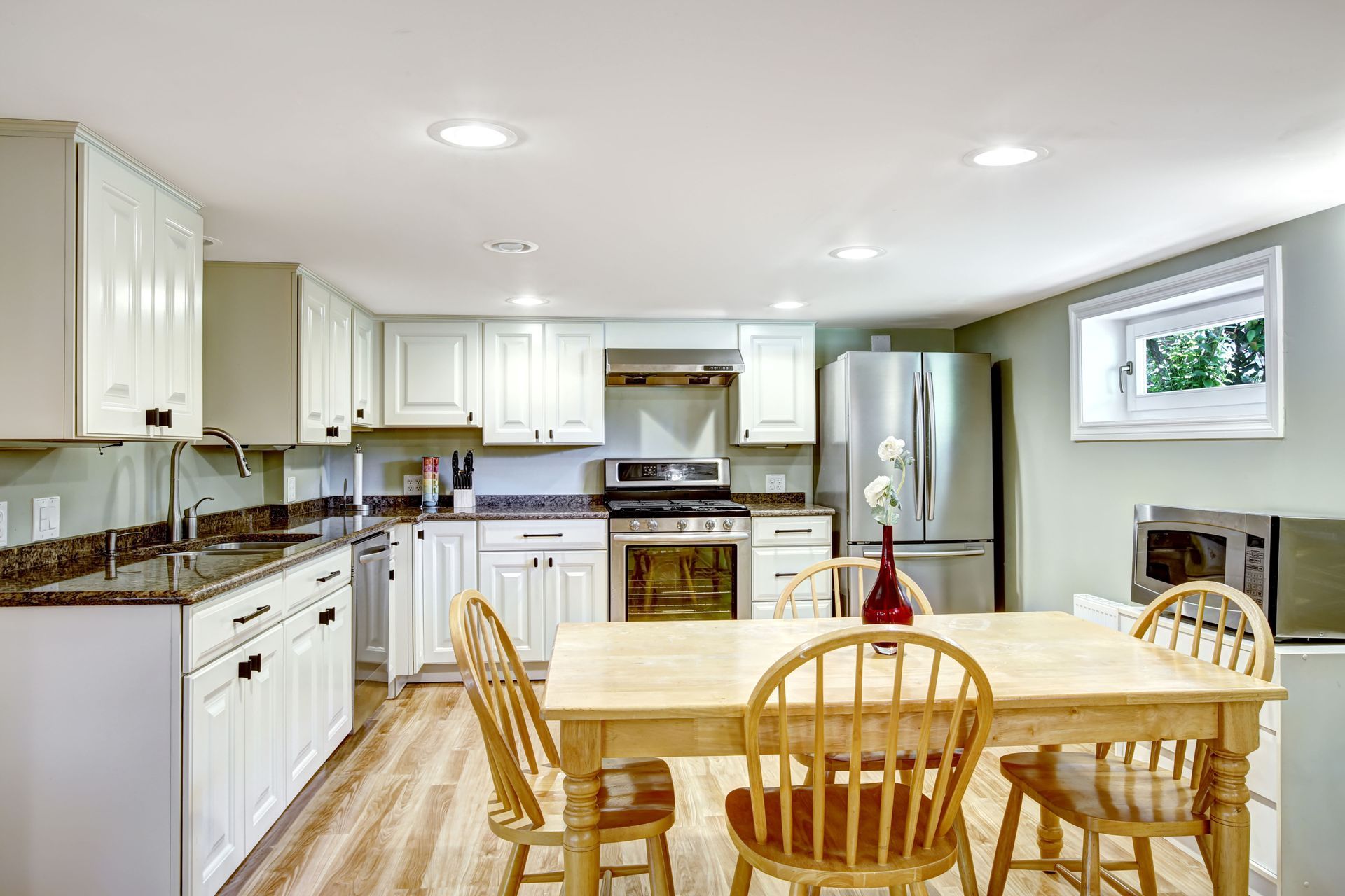
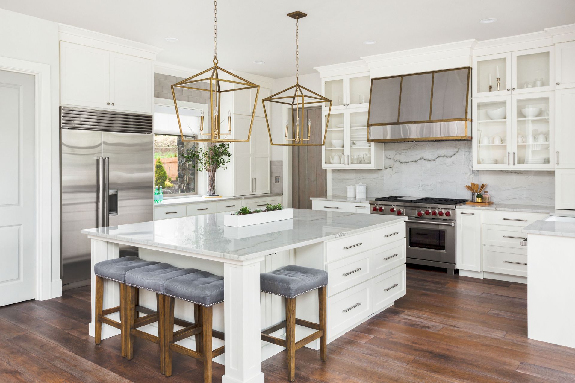
White continues to be one of the most popular choices for a kitchen remodel. Crisp white cabinets, walls, and backsplashes can create a clean, airy appearance that immediately makes a room feel larger. White also serves as a versatile backdrop that complements virtually any design style, from traditional to contemporary.
Soft gray is another excellent option. Lighter gray tones provide subtle contrast while maintaining an open feel. Many homeowners appreciate gray because it adds warmth and sophistication without overwhelming a smaller space.
Pale beige, cream, and ivory are also effective choices. These shades offer warmth that pure white sometimes lacks while still reflecting plenty of light. They work particularly well in kitchens that feature wood flooring or natural stone elements.
Combining light-colored walls with similarly toned cabinetry further enhances the effect. When there is little contrast between surfaces, the eye perceives a more continuous space, making the kitchen appear larger than it actually is.
Can a Bold Color Scheme Work in a Small Kitchen?
Many homeowners assume bold colors should be avoided in small spaces. While excessive use of dark or vibrant shades can make a room feel crowded, carefully planned bold accents can actually improve visual depth and character.
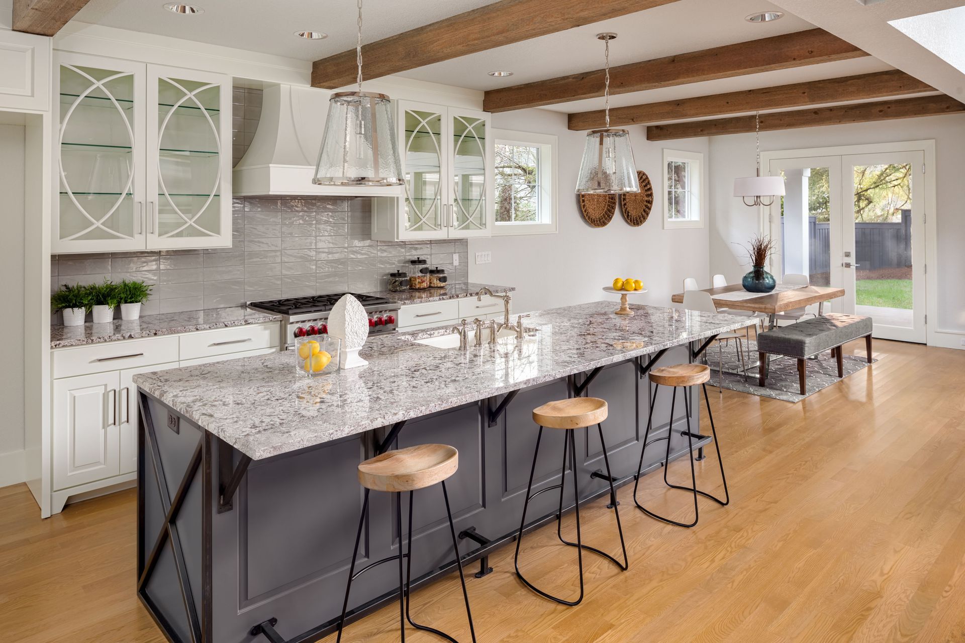
The key is moderation. During a kitchen remodel, bold colors can be incorporated through islands, accent walls, decorative shelving, or backsplashes rather than covering every surface. A navy-blue island surrounded by light cabinetry, for example, creates a focal point without reducing the sense of openness.
Deep greens, charcoal grays, and rich blues are popular choices because they add sophistication while maintaining a balanced appearance. When paired with lighter walls and countertops, these colors can create contrast that adds dimension to the room.
Bold colors can also draw attention away from the limited size of a kitchen by emphasizing architectural features or unique design elements. A brightly colored backsplash or statement range hood can create visual interest that shifts focus away from square footage.
Lighting becomes especially important when using bold colors. Adequate natural and artificial lighting prevents darker tones from absorbing too much light and making the room feel enclosed. This balance allows homeowners to enjoy dramatic color choices while preserving the spacious feel they want from their kitchen remodel.
How Do Neutral Colors Affect Kitchen Size Perception?
Neutral color palettes have remained popular for decades because of their ability to create calm, versatile spaces. In smaller kitchens, neutral tones are particularly effective at enhancing the perception of size.
Colors such as white, beige, taupe, cream, and light gray create visual continuity. Because these shades blend smoothly together, the eye moves naturally throughout the room without encountering abrupt visual interruptions. This uninterrupted flow makes spaces feel larger and more cohesive.
Neutral palettes also reflect light efficiently. Whether sunlight enters through windows or artificial lighting illuminates the room, lighter neutral shades help distribute brightness evenly. This reduces harsh shadows that can make corners appear cramped.
Another advantage of neutral colors is their flexibility. During a kitchen remodel, homeowners often want design choices that remain attractive for years. Neutral palettes adapt easily to changing trends because accessories, hardware, and decorative accents can be updated without requiring a complete redesign.
Layering multiple neutral shades can prevent the kitchen from feeling sterile or bland. For example, pairing white cabinetry with light gray walls and warm beige accents creates depth while maintaining openness. The subtle variations add interest without reducing the perception of space.
Are There Any Specific Color Tricks to Make a Kitchen Look Larger?
Beyond selecting individual colors, several design techniques can maximize the illusion of space during a kitchen remodel.
One effective strategy is using monochromatic color schemes. By choosing varying shades of the same color family, homeowners create visual continuity that makes the room feel less segmented. The absence of sharp color transitions allows the eye to travel smoothly throughout the space.
Painting walls and cabinets in similar colors is another useful approach. When cabinets blend with surrounding walls, they appear less bulky and intrusive. This visual integration can significantly increase the perception of openness.
Glossy finishes can also contribute to a larger appearance. Reflective cabinet surfaces, backsplashes, and countertops bounce light throughout the room, creating additional brightness and depth. Even subtle sheen levels can make a noticeable difference.
Another common technique involves using darker flooring paired with lighter upper surfaces. This combination grounds the room while maintaining brightness where it matters most. The contrast creates visual balance without shrinking the space.
Glass-front cabinets can further enhance openness by breaking up large blocks of solid cabinetry. The transparency adds depth and reduces visual weight, making the kitchen feel less crowded.
What Role Does Natural Lighting Play in Color Schemes?
Natural light is one of the most important factors influencing how colors appear within a kitchen. The same paint color can look dramatically different depending on the amount and direction of sunlight entering the room.
A successful kitchen remodel should consider both color selection and lighting conditions simultaneously. Light-colored surfaces amplify natural light, helping it spread throughout the space. This increased brightness contributes directly to the perception of size.
North-facing kitchens often receive cooler, softer light. In these spaces, warmer whites, creams, and beige tones can help counteract potential dullness and create a more welcoming atmosphere.
South-facing kitchens typically receive abundant sunlight throughout the day. Homeowners often have greater flexibility in their color choices because strong natural light enhances brightness regardless of the selected palette.
Window treatments also play a role. Heavy curtains can block valuable daylight, while sheer coverings allow sunlight to enter and interact with color schemes more effectively. Maximizing natural light helps every design element contribute to a more spacious appearance.
Reflective materials can further enhance available light. Glass backsplashes, polished countertops, and metallic fixtures work alongside carefully chosen colors to distribute illumination throughout the room.
Creating a kitchen that feels larger does not always require expanding walls or increasing square footage. Strategic color choices can dramatically influence how a space is perceived, making even compact kitchens feel open, bright, and welcoming.
Light colors remain among the most effective options for enhancing spaciousness, while neutral palettes provide flexibility and timeless appeal. Bold colors can also play a valuable role when used thoughtfully as accents or focal points. Additional techniques such as monochromatic schemes, reflective finishes, and coordinated color transitions further strengthen the illusion of space.
Natural lighting serves as the foundation that brings these design choices to life. When color and lighting work together, they create a kitchen that feels significantly larger and more comfortable. As homeowners plan their next kitchen remodel, understanding these principles can help them maximize both the appearance and value of their investment while creating a space that feels more open and enjoyable every day. If you're looking to remodel your kitchen, reach out to the team at Under Construction Builders, LLC today!
Share On: